ColonCare
Type
Product Design (Concept Study)
Focus
UI/UX & Patient Experience
Timeline
2022 (Refined 2026)
Overview
ColonCare walks patients through one of the most overwhelming parts of getting a colonoscopy: prep. I built it to turn a stack of dense medical paperwork into a clear, step-by-step journey that actually informs and guides someone, instead of just handing them forms to sign.

The Problem
Medical paperwork is a mess, and it's not just annoying; it's genuinely confusing and anxiety-inducing for patients. In one study, 54.8% of patients reported not reading the informed consent document they had signed ahead of their procedure. They skim instead, which means they miss real preparation steps, steps that can affect their health and whether the procedure even goes smoothly.
The Goal
The goal was simple to state, harder to build: replace that mountain of paperwork with something a patient could actually get through. I needed a system that gives people information exactly when they need it, not all at once, so they end up fully prepared without ever feeling buried.

Balkan Medical Journal, 2014
Process & Artifacts
Prep is time-sensitive, and timing actually matters here, so the structure had to be chronological, not just organized by topic. I built the sitemap around three pillars: Learning, Preparing, and Post-Op.

User Testing
People could get through the core flow fine: the countdown, the bottom nav, moving between screens. But two of the three testers independently noticed there was no page title anywhere, so switching between Home and Learn left them unsure which page they were actually on. It’s a small thing to miss and an easy one to fix, but exactly the kind of gap you don’t catch until someone else is using the app.

A/B Testing
Patients span a wide age range, so I tested two ways of showing medical definitions: a pop-up versus a popover. 94% preferred the pop-up because it let them focus on one thing at a time without the rest of the page shifting around them. I applied the same thinking to task icons: filled circles versus outline-only states.

Filled vs. outline task icons


The Countdown Dashboard
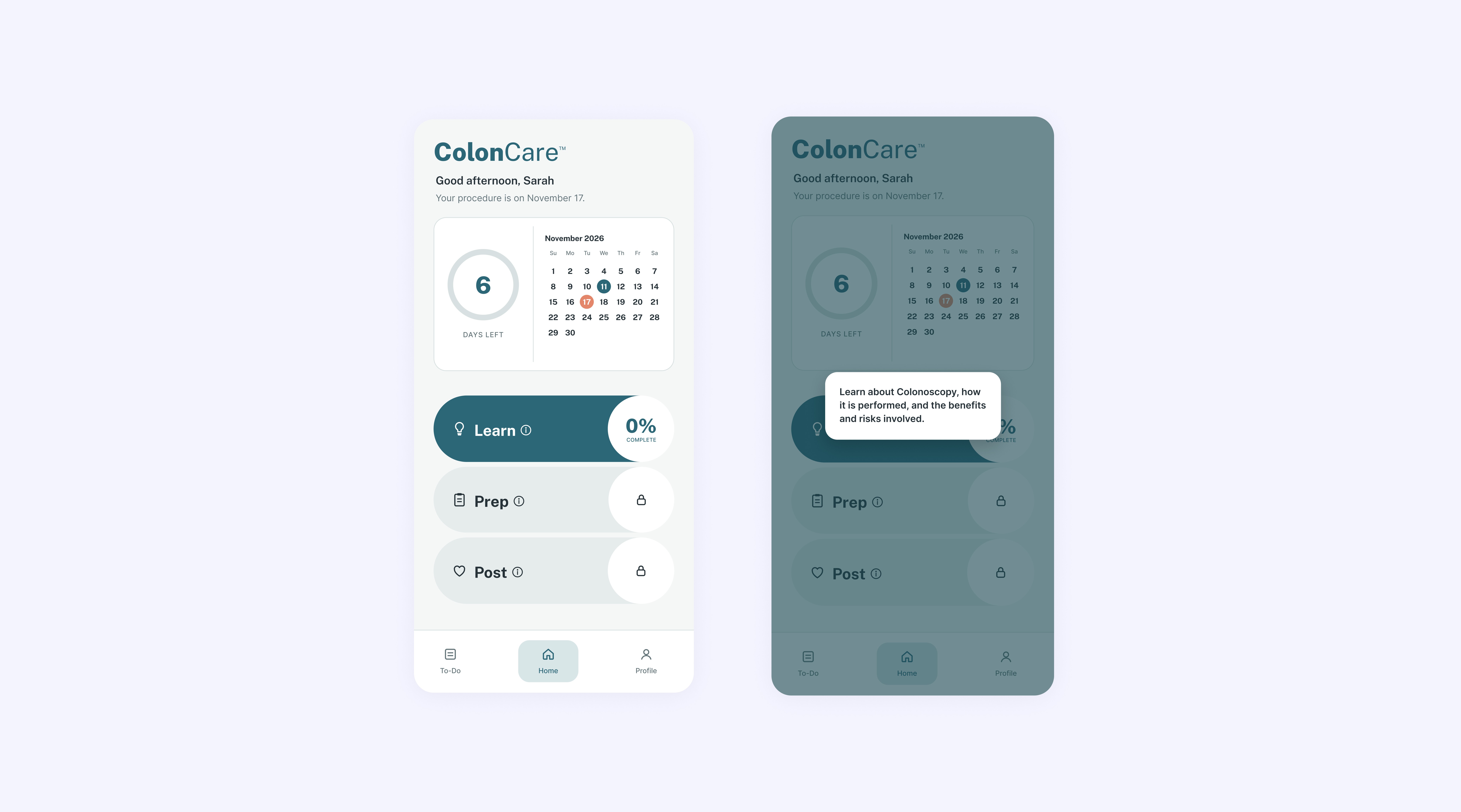
The home screen anchors everything around time, with a big countdown front and center, so a patient knows exactly where they stand in their prep the moment they open the app.
Progressive Learning & Locked Modules
Future prep phases stay locked until a patient finishes the learning module before them, so nobody gets hit with everything at once. Quick knowledge checks make sure they understand risks and benefits before confirming consent. Anatomy illustrations were recolored into the app’s own palette to feel calmer and less clinical.
UI: Learn flow + Test Your Knowledge screens

Actionable Task Management
Fasting and medication timing is strict and easy to get wrong. The task view turns static instructions into real interactive checklists, with custom push notifications for the steps that can’t slip.
UI: Today’s Tasks + Reminders screens

Retrospective
Coming back to this in 2026 let me strip out visual noise I didn’t need and focus purely on utility. The hardest part of designing for healthcare is balancing clinical accuracy with actual human empathy. Being more thorough usually means being longer and denser, and that’s exactly what makes an anxious patient skim or check out. The quiz verifies real understanding without turning into a test that adds pressure. The locked, progressive module structure does the same thing: information arrives in pieces, but nothing gets skipped before someone reaches consent. If I kept pushing this further, I’d look at integrating directly with hospital API systems, letting doctors see a patient’s prep checklist in real time before the patient even walks into the clinic.